
VitalSource studio
VitalSource Studio is a product developed at VitalSource Media with the power to create responsive and innovative digital first educational products. Whether that be EPUB3 documents, HTML courseware, or anything you could imagine creating. No matter the output, anything produced in Studio follows accessibility standards and is Section 508 compliant.
I was the lead UI designer developing this product. Starting with UX persona building, I worked with product managers, sales executives, as well as clients to construct a workflow that is simple without losing its original robust capabilities.
After the initial launch of Studio, one of my top priorities was gathering user data and feedback to help detect pain-points and improvements we needed to target. I managed a feedback system within the product for users to send their reactions, and I helped run face-to-face interviews, in which users were recorded using the product while following a testing plan. I then worked with others on the design team to analyze this data to pinpoint which areas of the product needed to be focused on in the immediate future, as well as develop a roadmap of improvements.
Below are a sampling of screenshots from Studio.
Personas
Persona building was the first step in creating Studio. Around fifteen people meet for a day to discuss the variety of people that will use Studio and their needs. We narrowed it down to five main personas that covered the range of users, Alice is shown above. As can be seen, we had some fun with the different personas, really discussing these people like they were real. From this exercise, we were given a standard based on facts, not opinions, to base our decision making on when developing features and user flows. If a feature didn't meet the needs of these five people, we knew it was not necessary for our product.
Management
Landing Page - Projects are organized in a clean, consistent grid for users to navigate quickly to their work.
Products - Within each Project, a user can create multiple Products.
Contents - A Product is organized in a familiar file structure that also translates to a TOC if one is needed. Users can assign screens to other users, set the status, and view how many flags are on each screen.
Builds - After a user is satisfied with their product, they can build it in various formats including ePub3. This page allows a simple step by step process to build, test, and publish to VitalSource Bookshelf if desired.
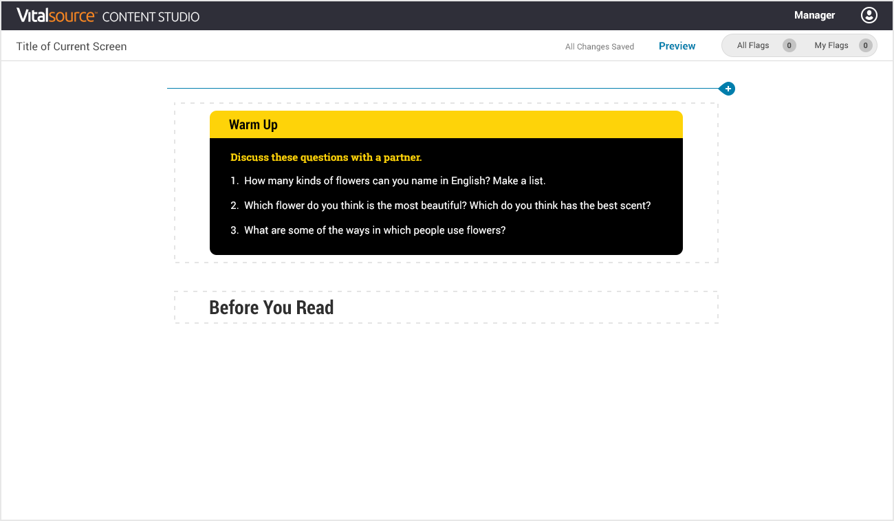
Editor
Editing is done inline with the surrounding content so a user can visually see their final product while creating it. A user adds a block from the picker, edits the content, and rearrange the blocks with a simple drag and drop functionality.
The editing interface needed to contain all the tools a content creator would need, but also be clean and easy to use. I've created an interface that is intuitive for any technical skill level, and powerful enough to support the needs of the hundreds of users. This screen shows how a user chooses from a number of blocks to create a full screen.


collaboration
I needed to include collaboration workflow tool within the product that was easy and quick for users. A simple flag system was developed to open and resolve flags for each block, as well as leaving comments and assigning to individuals. In the editor navigation top right, a user can view all the flags on the screen, or toggle to view flags only assigned to them to declutter their work environment.


Content Output
The content created in Studio is responsive from desktop to mobile devices. It also follows accessibility standards. Above is an example of a Fill-in-the-Blank Drop Down activity and a Multiple Choice activity.


Feedback and User Testing
Inside the product, we have a floating Feedback button for users to click at any point in their experience. The design team chose to add a Reason for Feedback section to help organize the data when it is submitted. We can use this data to help with molding the roadmap for Studio .
In person or recorded user testing is an extremely helpful process to utilize. I helped set up a test plan that lead the user through a number of actions within Studio and recorded the user actually doing the action. It was very important not to lead the user one way or another. The point is to get their genuine reaction to specific tasks to see how they might naturally accomplish the task at hand. We then used this data to change UI as well as UX functionality.